top of page

My Role:
Tool:
Timeline:
Deliverable:
Type:
Research, UX Design, UI Design, and Interaction Design
Figma, Miro, and Whimsical
June - Aug 2022
User Stories, User Flows, Wireframes, UI Animation, Hi-Fi Prototype
Maryland Institute College of Art Capstone Project
CONTEXT
The new wave of UX designers struggles to get noticed.
I sent out tons of applications. Sadly, I received many rejections and few responses.
--
My application tracker in 2021
The job market: I was frustrated by the lack of entry-level positions and stiff competition to land the few that do exist.


How might we boost job hunting prospects for
junior and aspiring UX designers?
FINAL SOLUTION
Take a peek
Snap a video profile to
showcase personality traits
Browse video job listings and
learn unique company culture
Learn other designers' stories and build connections with them
RESEARCH
Listened to other junior designers' job hunting stories


Low job application to response ratio: 1%-8%
the very first significant roadblock is the screening process. Many candidates cannot even get a call from recruiters.


Assumption
Shall I build a platform to find real-world projects and practice skills?....No


Digging deeper...unexpected findings

Pivot: the real problem to solve

DEFINE& DESIGN
3 user goals to stay focused and avoid scope creep

DESIGN: GOAL 1
Let the personality shine through
I was inspired by One Way Interview, personality tests, AI matching, and also dating apps like Hinge. Interviewing is like dating…in many ways right?
When putting all of them into a matrix, I found filming a video is the best option.
Considering nowadays people are familiar with taking a video on their phones, I decided to build my product on mobile first.

How long should the video be?
According to research, hiring managers usually spend less than one minute on a candidate’s profile, so the video should be short too!


USABILITY TESTING
6 participants living in the U.S.
3 junior UX designers
3 aspiring UX designers

ITERATION
How might we help users become comfortable recording video?

-
First, users can upload prerecorded videos because some users mentioned that being able to trim and edit videos makes them feel confident.
-
Next, I added a note above the recording button. The reason for choosing the specific area is because it is comfortable to reach when users hold phones with one hand.
-
The notes should not be too long; otherwise, they might cover up the user’s face in a video. So, I set a word limit (maximum 50 words).
-
After saving the notes, the notes will float on the lower screen.
-
When they are ready to film, after hitting recording, a big countdown appears in the center of the screen to give users a smooth transition.
DESIGN: GOAL 2
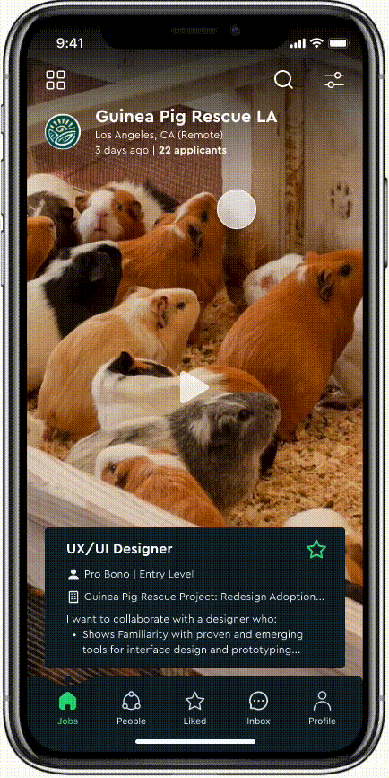
Browse, search and apply for jobs

The current job search platforms are text-heavy. They don't tell a good story of the company culture.


According to the research, some designers do not read each job description carefully. Instead, they just apply one after another like robots.
Since candidates record videos to showcase their personalities, I thought, what if companies can prepare videos of job postings and introduce their company cultures too?

DESIGN EXPLORATIONS
Immersive experience vs efficiency

In idea 1, I used the whole screen to show the company's video. Then, users scroll to move on to the next posting, just like watching TikTok.
-
Good: This experience is immersive. Users will spend more time understanding company culture. In addition, they have all the essential details in the preview notes below without opening the detail page each time.
-
Problem: However, this solution is time-consuming. Each time only one posting. What if some companies do not want to record a video?
In idea 2: I showed four postings on smaller cards.
-
Good: This solution is faster to sort and filter according to users' needs.
-
Problem: But videos could be tiny. It can cause cognitive overload if letting four videos play simultaneously. The space for job descriptions is small. Users might need to tap to view details more frequently.
A/B TESTING
They met the needs in different user scenerios

ITERATION
Combine the two views and allow users to easily switch between

-
I combined the two ideas by putting icons on the top left to allow users to switch between them.
-
I set a rule for the smaller card view. When scrolling, only the video on the top left will be auto-played. The others remain static. By doing this, users will not feel overwhelmed by autoplay content.
DESIGN: GOAL 3
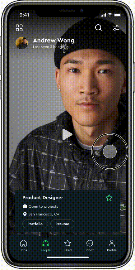
Learn other designers' stories and build connections
The flow of browsing and connecting with other designers is similar to job postings.
In the initial design, the profile was very long and repetitive, and it caused a burden for users to set up their profiles too.
What if users cannot get instant gratification in the app and start disappearing? Do users need that many details to connect with others?

ITERATION
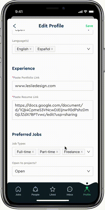
Make the profile less daunting to view / set up on mobile

-
I prioritized the necessary information again and asked the participants for feedback. Finally, I settled down on two groups of information.
-
The primary group is what needs to include in the preview card, while I can put the second group of information in the profile detail screen.
-
People are usually interested in portfolios and resumes, so I provided buttons on the preview card so that users can tap on them and quickly view their experience and work.

-
I tried to ensure users could complete all the information on one screen.
-
I used dropdown selections to reduce the long typing time on mobile devices.
UI & STYLE GUIDE
Make users feel refreshed and optimistic when using
the app

Final Work

NEXT STEP & REFLECTION
Next: UXER Employer
Flow 1: Posting a Job + Video Introduction
Flow 2: Browse, search and filter designers
Flow 3: Receive applications and contact candidates
Next: UXER Mentorship
Once you find a job and are no longer a junior — Give back to the community and help others
What I learned:

Thank you for reading! 👏🏻


bottom of page